
Every marketing platform has a reporting problem. Not a technical one. A financial one.
When Meta reports that your campaign drove 847 conversions last month, they are using a measurement system they built, maintained, and optimized to make their own numbers look as good as possible. Same with Google. Same with TikTok, LinkedIn, and every other platform that sells you media and then grades its own homework.
This is not a conspiracy. It is just how the business works. And if you are running six or seven figures in annual media spend without an independent measurement layer sitting above all of it, you are making budget decisions based on data that has a structural incentive to mislead you.
Media mix modeling is that independent layer. Here is what it actually does and why the output tends to surprise even experienced marketing teams.
The core problem with platform attribution
Before you can appreciate what MMM tells you, you need to understand what platform attribution is doing wrong.
Every platform uses some version of last-touch or multi-touch attribution. A user sees your Google ad, clicks it, comes to your site, does not convert. Three days later they see a retargeting ad on Meta, click that, and buy. Meta counts the conversion. Google may also count the conversion depending on your window settings. Your CRM counts one sale.
You can see where this is going. If you add up all the conversions each platform claims credit for, the total will be significantly higher than the number of actual sales you made. We have audited accounts where the sum of platform-reported conversions was more than double verified revenue. The platforms are not lying exactly. They are just each telling their own version of the truth.
Attribution models try to solve this by dividing credit across touchpoints. But they still rely on pixel-level tracking, which has been progressively degraded by iOS privacy changes, browser cookie restrictions, and ad blockers. Depending on your audience, you may be running blind on 30 to 60 percent of your actual conversion path.
The result is that you are optimizing your budget based on a model that is both inflated and incomplete. You shift money toward the channels that look best in the dashboard. But the dashboard is built on a foundation that has structural cracks in it.
What MMM does differently
Media mix modeling does not rely on pixel tracking at all. It does not care about individual user journeys. Instead, it looks at aggregate data over time and asks a simpler question: when spend in a given channel goes up or down, what happens to outcomes?
You feed the model your historical spend by channel, your conversion or revenue data, and any external factors that might affect performance, things like seasonality, promotions, or market events. The model then fits a statistical relationship between each channel’s spend and the observed outcomes, controlling for everything else happening at the same time.
The output is a set of response curves for each channel. These curves show you two things that platform data fundamentally cannot show you.
The first is the true incremental contribution of each channel. Not who clicked last, not who touched the path, but how much of your actual revenue can be attributed to each channel when you hold everything else constant. This number is almost always different from what the platforms report, and the direction of the difference is not always what you expect.
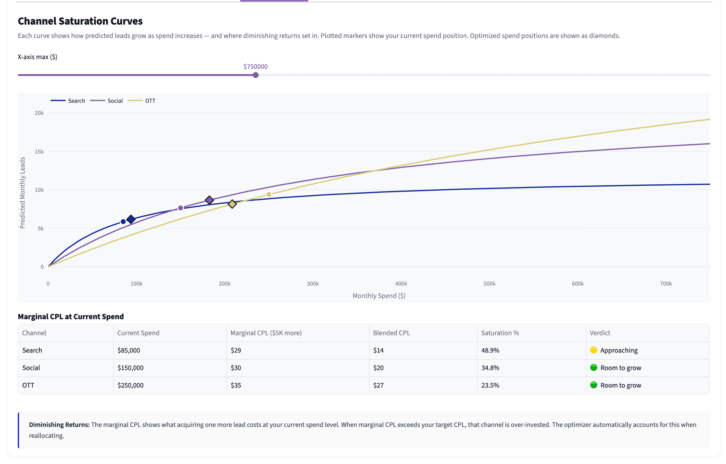
The second is saturation. Every channel has a point where additional spend stops generating proportional returns. The curve flattens. You are still getting conversions, but each additional dollar is buying you less than the dollar before it. Platform dashboards have no mechanism to show you this. They will happily take your budget increase and report the additional conversions without telling you that you were already past the efficient zone before you increased spend.
What the output actually looks like
When we run an MMM for a client, the first deliverable is a set of response curves for every active channel. A typical curve for a paid search campaign might show strong incremental returns up to around $80,000 per month in spend, then a notable flattening from $80,000 to $120,000, then near-zero incremental return beyond that.
If that client is spending $150,000 per month on paid search, they have roughly $70,000 sitting in a zone where it is generating almost no additional revenue. That money did not disappear. The platform reported conversions on it. But the conversions would have happened anyway because the audience was already saturated.
The second thing we typically see is channel revaluation. In most accounts we analyze, there is at least one channel that looks mediocre in the platform dashboard but shows strong incremental contribution in the model. This is almost always a top-of-funnel channel, things like display, streaming audio, or connected TV, that does not get last-click credit but does meaningfully influence the decision before the final touchpoint. Cutting that channel because it “doesn’t convert” will often cause performance to drop in channels that look unrelated, which is confusing to explain without the model.
We also frequently find the inverse. A channel that looks strong in the dashboard, typically one with heavy retargeting, turns out to have low incremental contribution in the model. These are channels that are capturing conversions from people who would have converted anyway. They are not growing the pie; they are just taking credit for slices that were already spoken for.
What MMM cannot tell you
It is worth being direct about the limitations, because this is where the methodology gets oversold.
MMM requires historical data to fit the model. You generally need at least 12 months of weekly spend and outcome data across channels to get reliable results, and 18 to 24 months is better. If you are a newer business or you have made major strategic pivots recently, the historical data may not reflect your current reality well enough to be actionable.
MMM also operates at the aggregate level. It can tell you that paid social is driving strong incremental contribution at your current spend level, but it cannot tell you which campaign, which creative, or which audience segment is responsible. For tactical optimization decisions you still need platform-level data. MMM is a strategic tool, not a campaign management tool.
Finally, MMM is a model, which means it is an approximation of reality. The output comes with confidence intervals, not certainties. A well-built model gives you a defensible directional view of where to put your money. It does not give you a guarantee.
When MMM actually makes sense to invest in
If you are running less than $500,000 per year in total media spend, the investment in a full MMM build may not pencil out immediately. The historical data may be thin enough that confidence intervals are too wide to be useful, and the efficiency gains may not cover the cost of the analysis in the first year.
Between $500,000 and $2 million in annual spend, MMM starts to become a very reasonable investment. The saturation insights alone often identify enough misallocated spend to generate a clear return on the analysis cost within the first quarter.
Above $2 million, running without some form of independent measurement model is a significant risk. At that level the cost of systematic misallocation compounds quickly — the gap between platform-reported performance and actual incremental performance tends to be wide enough that even a small correction in allocation materially affects business outcomes.
The thing most teams miss
The hardest part of implementing MMM findings is not technical. It is organizational.
When the model tells you that your best-looking channel in the dashboard is actually your least efficient channel in reality, you are asking a marketing team to move budget away from the thing that makes their reports look good. That is a harder conversation than it sounds. The platform dashboard has been telling everyone that channel is working. Cutting it feels like cutting something that works.
This is why we always pair MMM output with a clear explanation of the difference between correlation and incrementality, and with a staged budget test rather than an immediate full reallocation. Move 10 to 15 percent of the flagged budget to the higher-efficiency channels over 60 days and measure what happens to total outcomes. The model prediction should hold, and when it does, the organizational conversation about the larger reallocation becomes much easier.
The data is only as useful as the decisions it enables. Getting the model right is step one. Getting the organization to act on it is the work that actually moves revenue.
Working with King Data Lab: We build media mix models for growth teams and performance agencies who need a measurement foundation they can trust. If you want to understand what your current channel mix is actually doing, the Analytics Health Check (a free audit of your current tracking setup) is a good starting point, or reach out directly and we can talk through what your data would need to support a full model.